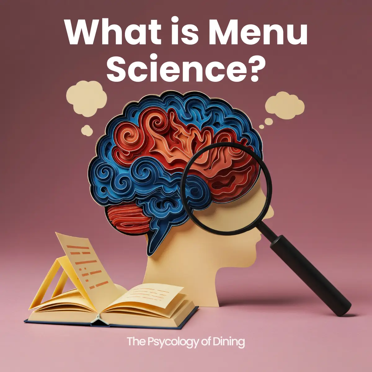
How Restaurants Use Menu Science to Influence Your Dining Experience and Spending: The Definitive Guide to Menu Psychology, Design, and Engineering
Every time you walk into a restaurant, glance up at a drive-thru board, or scroll through a digital ordering kiosk, you are entering a carefully engineered environment. The menu you see is not simply a list of food and prices. It is a strategic document — a selling tool built on decades of behavioral research, cognitive psychology, pricing theory, and design science. The best-performing restaurants in the world treat their menus with the same analytical rigor that tech companies apply to landing pages and that retailers apply to shelf placement. And the results are measurable: higher average check sizes, faster ordering times, greater customer satisfaction, and significantly improved profit margins — all achieved without changing a single recipe.
This guide is the most comprehensive resource available on the science of menu design. Drawing on the OSM Solutions QSR Menu Psychology Thesis (2026), the foundational research of Cornell University’s Food and Brand Lab, the menu engineering framework developed by Kasavana and Smith in 1982, and the behavioral economics work of researchers like Dan Ariely and Robert Cialdini, we will walk through every major principle that governs how menus shape human decision-making. Whether you operate a single-location quick-service restaurant, a multi-unit fast-casual brand, or a fine-dining establishment, the principles in this article apply to you — and implementing them through modern digital menu boards makes the application faster, more precise, and more profitable than ever before.
The Serial Position Effect: Why the First and Last Items on Your Menu Outsell Everything in Between
One of the most powerful and well-documented phenomena in menu psychology is the serial position effect, codified in the OSM Solutions research as the Law of Prime Position. The principle is borrowed directly from cognitive psychology: when human beings encounter a list of items, they disproportionately remember and favor the items at the beginning (the primacy effect) and the items at the end (the recency effect). Everything in the middle suffers from what researchers call the serial position disadvantage — it is encoded less deeply into memory and, when it comes to menu design, it receives fewer orders.
The data on this effect is striking. According to the OSM Solutions QSR Menu Psychology Thesis, Position 1 in any menu category generates approximately 31 percent more orders than items placed in middle positions. The last position in a category generates roughly 18 percent more orders than middle positions. These are not marginal differences. For a restaurant processing hundreds or thousands of transactions per day, shifting a high-margin item from the middle of a category to the first or last position can produce thousands of dollars in additional monthly profit without any change to pricing, ingredients, or labor.
Position One: The Price Anchor
The first position in any menu category serves a dual function. It captures the primacy effect — the cognitive tendency to pay more attention to and better remember the first item encountered — and it sets the price anchor for the entire category. This is why the OSM Solutions framework recommends placing the most premium, most expensive item in Position 1. The goal is not necessarily to sell the most units of this item, although that can certainly happen. The goal is to establish a high reference price in the customer’s mind so that every subsequent item in the category feels relatively affordable by comparison. A twelve-dollar sandwich feels expensive in isolation. Placed immediately after an eighteen-dollar signature sandwich, that same twelve-dollar sandwich feels like a smart, moderate choice. This is the anchoring effect at work, and it operates automatically and unconsciously in nearly every consumer.
Position Two: The Star Item
Position 2 is, according to the research, the single highest-conversion position on the menu. The customer has already been exposed to the premium anchor in Position 1 and has calibrated their price expectations upward. Now, in Position 2, they encounter what the menu engineering framework calls the Star item — a high-margin, high-popularity item that represents the best balance of value and profitability for the restaurant. The customer evaluates this item against the anchor already established, perceives it as a good deal, and orders it at a disproportionately high rate. Restaurants that understand this principle assign their most profitable signature item to Position 2 in every major category.
The Last Position: Recency Capture
The final position in a category benefits from the recency effect — it is the last item the customer reads before making a decision, and it lingers in short-term memory. The OSM Solutions framework recommends using this position for a second high-margin item, a limited-time offer that benefits from the extra memorability, or a unique brand differentiator that leaves a lasting impression. Many successful restaurants use the last position for items that tell a story — a house specialty, a chef’s creation, or a locally sourced offering that reinforces the brand’s identity.
The Middle Positions: Where Necessity Lives
Middle positions are the weakest real estate on any menu. Items placed here receive less visual attention, less cognitive processing, and fewer orders. The strategic implication is clear: middle positions should be reserved for low-margin items that loyal customers will seek out regardless of placement. These are the staples, the commodities, the items that customers already know they want. They do not need the boost of a prime position because demand for them is driven by habit, not by menu influence. Placing a high-margin item in the middle of a category is one of the most common and costly mistakes in menu design.
Price Anchoring and the Psychology of Perceived Value
The anchoring effect is one of the most robust findings in all of behavioral economics, and its application to menu design has been studied extensively. The principle, described by Dan Ariely in his landmark 2008 book Predictably Irrational, states that the first number a person encounters in a decision context disproportionately influences all subsequent numerical judgments. In menu design, this means the first price a customer sees becomes the reference point against which all other prices on the menu are evaluated.
The OSM Solutions research codifies this as the Law of the Anchor and makes the strategic implication explicit: always anchor high. The most premium, highest-priced item should appear first — not buried in the middle of the menu, and certainly not at the end. When a customer’s first price exposure is a twenty-two-dollar entree, a fourteen-dollar entree later in the menu feels moderate and reasonable. But when a customer’s first price exposure is a six-dollar appetizer or a value-meal deal, that same fourteen-dollar entree now feels expensive by comparison. The anchoring effect is not a subtle influence — it fundamentally reshapes the customer’s perception of the entire pricing landscape of the menu.
Why You Should Never Lead with Value
One of the most counterintuitive findings in menu science — and one that many restaurant operators resist — is that leading with value pricing or discount sections actively suppresses average check size. The instinct to showcase affordability is understandable, especially in competitive markets. But the research is unambiguous: when the first thing a customer sees is a low price, their internal reference point is set low, and every subsequent price on the menu triggers a relative cost evaluation that makes the restaurant feel expensive. The OSM Solutions category sequencing framework addresses this directly. The recommended sequence begins with Signature or Featured Items — the highest-quality, highest-margin offerings — which set both the quality anchor and the price anchor. Core entrees and mains follow, evaluated against the premium anchor already established. Combos and value bundles come third, framed not as the cheapest option but as a smart upgrade after the customer has already mentally committed to a main item. Sides, beverages, desserts, and accommodations round out the sequence. Value pricing, if it exists at all, should appear later in the menu flow, never at the top.
The Decoy Effect: How a Third Option Changes the Choice Between Two
Closely related to price anchoring is the decoy effect, a concept explored extensively by Dan Ariely and one of the most powerful tools in menu engineering. The decoy effect occurs when the introduction of a third option — which is intentionally less attractive than one of the original two options — shifts customer preference toward the option the restaurant wants to sell. Consider a simple example: a restaurant offers a regular burger for eight dollars and a premium burger for fourteen dollars. Many customers will choose the regular burger. But if the restaurant introduces a mid-tier burger for twelve dollars that includes fewer toppings than the premium burger, the fourteen-dollar premium burger suddenly looks like a much better deal by comparison. The twelve-dollar burger is the decoy — it exists not to be the top seller, but to make the premium option appear more valuable. This is the principle Ariely calls asymmetric dominance, and it is used in everything from subscription pricing to airline seating. On a restaurant menu, it is one of the most effective tools for guiding customers toward high-margin items.
The Invisible Price: Making Cost a Non-Issue
The way prices are visually presented on a menu has a measurable impact on how much customers spend. A landmark 2009 Cornell study by Sybil Yang, Sheryl Kimes, and Mauro Sessarego tested three different price formats: prices with dollar signs ($14.00), prices with the word “dollars” spelled out (fourteen dollars), and simple numeral-only prices (14). The results were significant. Guests presented with numeral-only prices — no dollar sign, no currency word — spent meaningfully more than guests in either of the other two conditions. The dollar sign activates what psychologists call the pain of paying — a neurological response associated with financial loss. Remove the symbol, and the pain diminishes.
The OSM Solutions framework extends this finding into a comprehensive set of invisible price rules. Prices should use numerals only, with no dollar signs. They should appear inline after the item description or in a right-aligned flush column, but never with dot leaders — those dotted lines that create a visual highway from the item name directly to the price, making cost the focal destination of the eye. Price typography should be regular or medium weight, never bold, because bold prices visually emphasize cost. The size of the price should be equal to or slightly smaller than the item name, never larger. And the choice between round numbers and charm pricing should be deliberate: round numbers (14) convey premium positioning and confidence, while charm pricing (13.99) signals value orientation. The goal across all of these decisions is the same: the price should be visible and findable, but it should never be the most prominent element on the menu. The food should be the hero, not the cost.
Choice Architecture: Why Fewer Options Lead to More Sales
In the year 2000, psychologists Sheena Iyengar and Mark Lepper published a study that would become one of the most cited findings in behavioral economics. Conducted at an upscale grocery store, the experiment presented shoppers with either a display of 24 varieties of jam or a display of just 6 varieties. The results were dramatic. While the larger display attracted more initial interest — more people stopped to look — the smaller display generated ten times more actual purchases. The large display, it turned out, created what Iyengar and Lepper termed choice overload: so many options that the decision became overwhelming, and most shoppers simply walked away without buying anything.
This finding maps directly onto menu design, and its implications have been validated in the restaurant context by numerous subsequent studies. The OSM Solutions framework codifies it as the Law of Limited Choice, drawing on George A. Miller’s foundational 1956 paper on cognitive load, which established that human short-term memory can reliably process seven items, plus or minus two. Applied to menu categories, the rule is clear: no single category should contain more than seven items. The ideal range is five to six items per category. Beyond seven items, decision anxiety increases, satisfaction with the chosen item decreases (because the customer wonders whether one of the many unchosen options might have been better), and customers default to one of two fallback strategies — ordering whatever they always order (eliminating the menu’s influence entirely) or choosing the cheapest option (suppressing average check size).
Splitting Large Menus into Named Sub-Sections
Many restaurants, particularly those with extensive offerings, resist the idea of limiting categories to seven items. The solution is not to ignore the research but to restructure the menu. A category of fourteen burger options, for example, should be split into two named sub-sections of seven or fewer items each — perhaps “Classic Burgers” and “Specialty Burgers,” or “Quarter Pounders” and “Signature Half Pounders.” Each sub-section is now its own cognitive category, each with its own primacy and recency positions, and each within the manageable range that allows customers to make confident, satisfying decisions. The naming of sub-sections also creates an opportunity for additional descriptive language and brand storytelling, reinforcing the restaurant’s identity while solving the choice overload problem.
The Paradox of Choice and Customer Satisfaction
It is important to understand that the negative effects of excessive choice are not limited to the ordering moment. Research has consistently shown that when people choose from a large set of options, they report lower satisfaction with their selection after the fact, even when the selection itself is objectively excellent. This is because a large option set increases the psychological phenomenon of counterfactual thinking — the tendency to imagine how the unchosen alternatives might have been better. A customer who chose one burger from a list of twenty is statistically more likely to feel a twinge of regret than a customer who chose from a list of five, even if both customers received the same burger. For restaurant operators, this means that menu simplification is not just a sales strategy — it is a customer satisfaction strategy. Fewer, better-curated options lead to more confident decisions, higher satisfaction, more positive reviews, and greater repeat visit likelihood.
The Power of Descriptive Language: How Words Change the Taste of Food
In 2001, Brian Wansink, James Painter, and Koert Van Ittersum at Cornell University’s Food and Brand Lab published a study that would fundamentally change how the restaurant industry thinks about menu language. The researchers took identical dishes and presented them to two groups of diners. One group received the dishes with plain, utilitarian menu names — “grilled chicken,” “chocolate cake,” “green beans.” The other group received the exact same dishes with evocative, descriptive names — “tender grilled free-range chicken,” “velvety Belgian chocolate cake,” “fresh-harvested garden green beans.” The food was identical. The preparation was identical. Only the words on the menu differed.
The results were remarkable on two levels. First, descriptive labels increased sales by an average of 27 percent compared to plain labels. Customers were significantly more likely to order an item when its name evoked sensory imagery. Second — and this is the finding that surprised even the researchers — customers who ate the descriptively named dishes rated the food as tasting better. They reported higher satisfaction with their meal. They were more likely to say they would return. The words on the menu literally changed the perceived taste of the food. This phenomenon, which Wansink termed sensory pre-experience, occurs because descriptive language activates the brain’s sensory processing centers before the food arrives. The customer begins to simulate the eating experience while reading the menu — imagining the crunch, the warmth, the aroma — and this simulation primes the actual experience for higher satisfaction.
The Five Categories of Sensory Language
The OSM Solutions framework identifies five categories of sensory language that are most effective in menu descriptions, each activating a different dimension of the customer’s imagination. Texture language — words like “hand-breaded,” “crispy,” “golden-fried,” “slow-braised,” and “melt-in-your-mouth” — evokes the tactile and mouthfeel experience of eating. Origin and geographic language — “Gulf Coast shrimp,” “Vermont aged cheddar,” “Texas-smoked,” “house-made” — signals authenticity, provenance, and quality while activating place-based associations. Method language — “wood-fired,” “stone-ground,” “slow-cooked,” “flash-grilled,” “cold-smoked” — communicates craftsmanship and care, implying that the food was prepared with deliberate skill rather than mass-produced. Nostalgia and emotion language — “classic,” “homestyle,” “Grandma’s recipe,” “like you remember” — taps into the powerful emotional associations between food and memory, comfort, and belonging. Freshness language — “just-cut,” “daily-baked,” “fresh-never-frozen,” “picked this morning” — addresses one of the most fundamental quality cues in food evaluation, the perception of freshness and natural integrity.
The Ideal Description Length
The research is specific about how long menu descriptions should be. In a quick-service or fast-casual context, the sweet spot is 10 to 20 words per item description. Descriptions shorter than ten words tend to be too brief to activate the sensory pre-experience effect — they read as basic ingredient lists rather than evocative language. Descriptions longer than twenty words run into a different problem: they simply are not read, especially in a QSR environment where customers are making decisions in seconds under time pressure. The goal is a compact, vivid burst of language that paints a sensory picture in the customer’s mind in the time it takes to scan a menu item. A description like “Hand-battered Gulf shrimp, golden-fried and served with our house-made tangy remoulade and fresh-cut lemon” is sixteen words, rich in sensory and origin language, and can be absorbed in a single glance. It is the kind of description that sells.
Description Typography and Hierarchy
How descriptions are visually presented matters as much as what they say. The OSM Solutions typography framework specifies that descriptions should always be set in regular weight — never bold. Bold descriptions compete visually with item names, creating confusion in the visual hierarchy and diluting the impact of both elements. Descriptions should be rendered in sentence case (not ALL CAPS, not Title Case) and in a medium gray color that creates visual breathing room between the item name above and the price below or beside it. The maximum line length should be approximately 60 characters to maintain comfortable reading pace. These typographic choices are not aesthetic preferences — they are functional requirements that ensure the description is read, not skipped, and that it occupies its correct place in the four-level visual hierarchy: category headers, item names, descriptions, and prices, in descending order of visual weight.
Color Psychology: Why Warm Tones Make People Hungrier and Blue Kills Appetite
Color is not decoration. On a menu, color is a physiological trigger. The relationship between color and appetite has been studied extensively in both food science and marketing, and the findings are consistent and emphatic. Warm colors — red, orange, amber, gold, cream, tan, and terracotta — stimulate appetite through two complementary pathways. The first is direct physiological arousal: warm colors increase heart rate and metabolic activity, creating a subtle but measurable state of excitement and desire. The second pathway is evolutionary association: warm colors are the colors of ripe fruit, cooked meat, open flame, and sunlight. For hundreds of thousands of years, these colors have signaled food that is safe, nutritious, and ready to eat. The human brain responds to them automatically.
The OSM Solutions framework codifies this as the Law of Warm Tones and specifies that the entire color palette of a food menu — backgrounds, typography, photography tones, accent elements, and promotional graphics — should operate within the warm spectrum. This is not a suggestion for accent colors or highlights. It is a principle that applies to every color decision on the menu.
Red, Orange, Gold, and the Warm Brown Family
Among warm colors, red is the single most powerful appetite stimulant. It is ideal for callout boxes, limited-time offer badges, and featured item backgrounds. However, there is an important caveat: red used as body text color communicates discount, urgency, or clearance — associations imported from retail signage — rather than quality. Red should be used as a background or accent, not for item names or descriptions. Orange is the second most effective appetite color and has the added benefit of strong accessibility contrast. It is particularly effective for combo and bundle sections, where it communicates both appetite appeal and value. Warm gold conveys premium positioning — it is more sophisticated than pure yellow, which can read as cheap or juvenile, and is ideal for upscale QSR and fast-casual brands. The warm brown family — tan, terracotta, chocolate, sienna — has become the dominant color language of the premium fast-casual segment. These tones communicate naturalness, craft, artisanal quality, and earthiness, and they pair beautifully with food photography.
The Blue Rule: Why Blue Has No Place on a Food Menu
The OSM Solutions framework contains one of its strongest directives on the subject of blue: never use blue as a primary or significant color on a food menu. Blue is the single color most consistently associated with appetite suppression across every study that has examined the question. The reason is evolutionary. Blue is almost entirely absent from the natural food environment. With the exception of a handful of berries, there are virtually no blue foods in nature. Far more importantly, blue is the color most strongly associated with spoilage, mold, and decay in organic matter. The human brain has learned, over countless generations, that blue food is not safe to eat. This association operates below conscious awareness, but its effect on appetite is measurable and significant.
The only acceptable use of blue on a menu is in beverage sections, where the association with cold water, ice, and refreshment is contextually appropriate and even beneficial. Purple and violet share blue’s appetite-suppressing properties and should similarly be avoided, except in dessert sections or specialty beverage sections where associations with grape, lavender, or taro are contextually meaningful. Even seemingly neutral colors require attention: the OSM Solutions framework recommends replacing pure white backgrounds with warm off-white (in the range of #FDF8F0 or #FAF6EE) because pure white is appetite-neutral — a missed opportunity to contribute to the warm tone ecosystem. Similarly, pure black text should be replaced with near-black (#2C2C2C or #1C1C1E), which reads as warmer and more comfortable, particularly on digital displays where pure black against light backgrounds can create visual harshness.
The Four-Element Color System
The OSM Solutions research prescribes a four-element color system for every menu. The first element is the primary brand color, used for category headers and key brand elements, which must be a warm hue. The second is the accent or highlight color, used sparingly for callout boxes, badges, and promotional elements, which should contrast with the primary while remaining in the warm spectrum. The third is the background color, which should be a warm neutral — cream, tan, warm white, or another tone that supports appetite stimulation. The fourth is the text color, which should be near-black rather than pure black. This four-element system ensures color consistency, visual harmony, and appetite-appropriate signaling across every element of the menu. When these four elements are calibrated correctly, the menu feels warm, inviting, and subtly energizing — precisely the emotional state that encourages exploration, indulgence, and higher spending. Restaurants working with Menu Board Manager benefit from professional menu board content design that applies these color principles with precision across every screen in the system.
Visual Hierarchy and the Golden Triangle: Where the Eye Goes First
Every menu has geography. Just as a retail store has high-traffic aisles and low-traffic corners, a menu has zones of high visual attention and zones that most customers will never look at carefully. Understanding this geography — and placing items strategically within it — is one of the most impactful things a restaurant operator can do to influence sales mix.
The most important concept in menu visual hierarchy is the Golden Triangle, identified through eye-tracking research conducted at Cornell and other institutions. On a standard two-panel menu, approximately 60 percent of readers fixate first on the upper-right quadrant. The upper-left quadrant receives the second-highest fixation. The center of a tri-fold menu functions as the primary fixation zone. The bottom-left of any menu format receives the least attention of any position. The research quantifies the magnitude of this effect: the upper-right of a two-panel menu is worth roughly triple the conversion rate of the lower-left. For a restaurant, this means that the items placed in the upper-right quadrant are operating with an enormous built-in advantage, while items relegated to the lower-left are fighting an uphill battle for attention.
Photography as an Attention Magnet
Eye-tracking research by Park, Wansink, and Sotherden at Cornell (2010) demonstrated that items placed adjacent to photographs receive significantly higher fixation frequency than items in text-only sections of the menu. A high-quality photograph acts as a visual magnet, pulling the eye toward the section of the menu where it appears and transferring attention to nearby items. This is why the placement of photography on a menu is a strategic decision, not an aesthetic one. A photograph placed in the upper-right quadrant of a two-panel menu occupies the highest-attention zone and amplifies it further. A photograph placed in the lower-left attempts to rescue the lowest-attention zone but may not be powerful enough to overcome the inherent disadvantage of that position.
The OSM Solutions framework specifies that photography should be reserved for one to three signature or featured items and the current limited-time offer. Commodity items — basic sides, standard beverages, items that sell on the basis of familiarity and price rather than desire — should never be photographed. The reason is the figure-ground principle: photography creates visual contrast that draws attention. If every item on the menu is photographed, the contrast disappears and the photographs cease to function as attention magnets. One excellent photograph outperforms ten mediocre ones. And a poor-quality photograph — one with unflattering lighting, incorrect color temperature, or unappetizing composition — is actively worse than no photograph at all, because it suppresses appetite rather than stimulating it.
Negative Space as a Design Tool
One of the most underappreciated tools in menu design is negative space — the empty area surrounding a menu item. Items with more visual breathing room draw significantly more attention than items crowded together in dense text blocks. The effect is intuitive once you understand it: in a field of tightly packed information, the eye is drawn to the element that is different, and generous white space around an item makes it different. This is the figure-ground principle in action — the featured item becomes the figure, standing out against the ground of surrounding content. The OSM Solutions framework recommends using negative space as a deliberate, strategic design tool around featured items. Rather than adding more visual elements — more boxes, more badges, more colors — sometimes the most effective way to draw attention to an item is simply to give it more room to breathe.
The Law of the Single Hero
The figure-ground principle leads directly to one of the most important laws in the OSM Solutions framework: the Law of the Single Hero. Every menu panel should feature exactly one visually prominent hero item. The featuring effect — the ability of a callout box, photograph, or special treatment to drive higher sales — works through contrast with its surroundings. When multiple items compete for featured status on the same panel, the contrast collapses and the featuring effect disappears. The framework sets a maximum of one to three featured items across the entire menu. If you feature everything, you feature nothing. This principle requires discipline and strategic thinking. The items chosen for featured treatment should be the highest-margin signature items and the current limited-time or new items that need sales velocity quickly. They should never be loss leaders, compliance items, or staples that will sell regardless of visual treatment.
The Menu Engineering Matrix: Classifying Every Item for Strategic Positioning
In 1982, Michael Kasavana and Donald Smith at Michigan State University published a framework that would become the foundational tool of menu engineering. The Kasavana and Smith Menu Engineering Matrix classifies every item on a menu along two dimensions: contribution margin (how profitable the item is) and popularity (how frequently it is ordered). The intersection of these two dimensions creates four categories, each with its own strategic positioning and management approach.
Stars: High Margin, High Popularity
Stars are the ideal items — customers love them and the restaurant makes strong profit on every sale. The strategic imperative for Stars is to protect and promote. They should occupy prime menu positions — Positions 1, 2, or last in their category. They should receive featured treatment: callout boxes, photographs, social proof badges. They should be the items that servers are trained to recommend. Any menu redesign should be evaluated first on whether it maintains or improves the visibility and positioning of Star items. Stars are the engine of profitability, and everything else on the menu should be organized around supporting them.
Plowhorses: Low Margin, High Popularity
Plowhorses are the workhorses of the menu — popular items that customers order frequently but that generate modest profit per sale. The classic Plowhorse is a value-priced item that drives traffic but does not contribute proportionally to the bottom line. The strategic approach to Plowhorses is nuanced. They should be positioned prominently enough that customers can find them — buried too deeply, and customer satisfaction suffers because a favorite item is hard to locate. But they should not occupy prime positions that could be generating higher-margin sales. The real opportunity with Plowhorses is margin improvement: bundling them with high-margin sides or beverages, implementing modest price increases (even fifty cents can meaningfully improve contribution margin when multiplied by high volume), upgrading ingredients slightly and justifying a larger price increase, or creating premium versions that migrate customers to higher-margin alternatives.
Puzzles: High Margin, Low Popularity
Puzzles are the hidden opportunities on any menu. These items generate excellent profit per sale, but not enough customers are ordering them. The question is why. Sometimes the answer is poor positioning — a high-margin item buried in the middle of a crowded category will underperform regardless of its quality. Sometimes the answer is poor naming — a bland, utilitarian item name fails to create desire. Sometimes the answer is lack of visibility — no photograph, no callout box, no featured treatment. The OSM Solutions framework recommends moving Puzzles into prime positions and applying featured item treatment. In the research, this intervention typically converts a Puzzle to a Star within one to two months. The logic is straightforward: the item already has high margin, so the only problem to solve is awareness and desire. Better positioning and more compelling presentation solve both.
Dogs: Low Margin, Low Popularity
Dogs are the items that are neither popular nor profitable. The default recommendation is removal — every Dog on the menu occupies space that could be used for a Star or a Puzzle, and its presence adds to the total item count, contributing to choice overload without contributing to profitability. However, the decision to remove a Dog should account for operational considerations: does the item use ingredients that are shared with higher-performing items? Does it serve a specific customer segment (children, dietary restrictions) whose needs must be addressed? If a Dog must remain on the menu, it should be placed in the deepest middle positions — the lowest-attention zones — where it will be found by the customers who specifically want it without drawing attention or orders away from more profitable items.
Featured Item Treatment: A Hierarchy of Effectiveness
Not all featuring techniques are equally powerful. The OSM Solutions research ranks featured item treatments in order of their documented impact on sales, from most effective to least effective, and this hierarchy should guide every menu design decision about how to spotlight key items.
Hero Photography and Callout Boxes
The single most powerful featured item treatment is hero photography. A high-quality photograph of a food item creates sensory pre-experience that no other design element can replicate — the customer sees the food and begins to desire it on a visceral, pre-rational level. The research documents an average sales increase of 30 percent for photographed items compared to text-only items. However, the photograph must meet strict quality standards: shot at a 45-degree overhead angle (the dominant QSR photography angle), filling 75 to 90 percent of the frame, with warm color temperature (approximately 4,500 Kelvin, which makes proteins appear juicier and bread appear fresher), against warm background surfaces like natural wood, dark slate, craft paper, or terracotta tile. Minimum resolution should be 150 DPI at final display size. A poor-quality photograph — underlit, unflattering,