Why Menu Design Principles Matter for Your Restaurant
A well-designed menu is far more than a list of dishes and prices. It is a strategic sales tool that shapes how customers perceive your brand, what they order, and how much they spend. Whether you operate a quick-service taco shop or a full-service restaurant, applying proven menu design principles can directly influence revenue and guest satisfaction. When those principles are applied to digital menu boards, the impact multiplies because you gain the flexibility to update layouts, highlight promotions, and test new designs in real time.
Core Menu Design Principles That Drive Sales
The foundation of effective menu design starts with knowing your audience. Understanding your customers’ preferences, dietary restrictions, and spending habits allows you to tailor offerings that resonate. From there, simplicity is key. A clean, uncluttered layout helps guests find what they want quickly, which is especially important on digital screens where readability at a distance matters.
Organize your menu into clear categories such as appetizers, mains, desserts, and beverages. Use formatting hierarchy to guide the reader’s eye toward high-margin and signature items. Research consistently shows that strategic item placement increases orders of featured dishes. Highlight specialties with design elements like borders, icons, or dedicated sections so they stand out immediately.
Typography and color also play critical roles. Choose legible fonts that reflect your brand personality and remain readable even in dimly lit environments. Select a limited color palette that complements your branding and evokes the right emotions. Warm tones can stimulate appetite, while a restrained palette prevents visual overload. When displaying prices, keep them clearly visible but avoid dollar signs, as studies suggest the currency symbol can subtly deter spending.
Bringing Design Principles to Life on Digital Screens
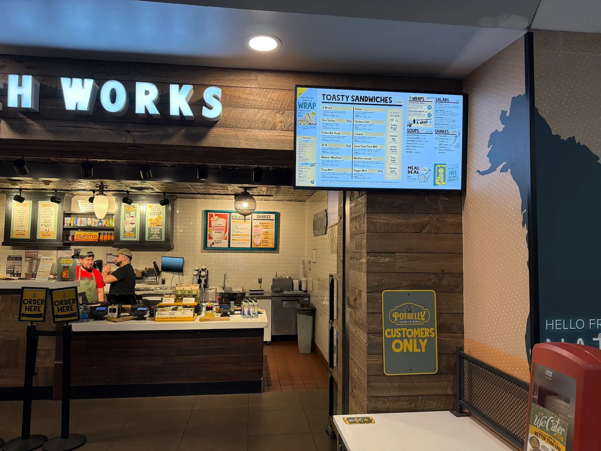
Digital menu boards give you a powerful canvas to execute these principles dynamically. High-quality food photography, for example, is proven to increase order rates, and digital screens display images with vibrant clarity that printed menus cannot match. Seasonal updates become effortless: swap in limited-time offers or daily specials without reprinting a single board. If your restaurant uses a POS system like Toast, real-time POS integration ensures that menu changes, pricing updates, and 86’d items sync automatically to your screens.
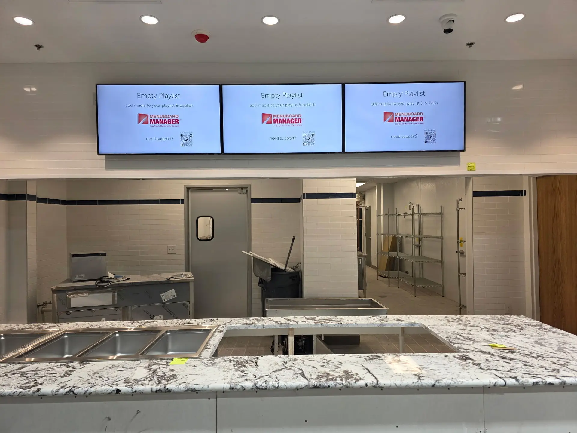
For operators who want professional results without an in-house design team, menu board content design services from Menu Board Manager can translate your brand identity into polished, conversion-focused layouts. Every element, from font selection to item placement, is optimized to align with the design principles outlined above.
Practical Example: Designing a Taco Shop Menu
Consider a taco shop that wants a simple yet visually appealing menu. The header displays the shop name in a bold, eye-catching font. Below it, categories break the menu into Traditional Tacos, Specialty Tacos, Vegetarian and Vegan Tacos, and a Build Your Own option. Each taco listing features an appetizing name, a short ingredient description, and a clearly aligned price. A separate section covers add-ons, extras, drinks, and sides. One or two signature tacos receive a highlighted callout to draw attention to unique offerings. Daily or weekly specials occupy a dedicated area that can be updated instantly on a digital display.
This structured approach keeps navigation intuitive, reinforces branding consistency, and uses visual hierarchy to guide purchasing decisions, exactly the kind of strategy that scales beautifully across drive-thru menu boards and indoor screens alike.
Start Optimizing Your Menu Design Today
Your menu is a direct reflection of your restaurant’s identity. Applying these design principles, whether on a single screen or across multiple locations, can enhance the dining experience, boost average ticket size, and build lasting customer loyalty. Menu Board Manager provides the software, hardware, and expert support to bring your vision to life. Ready to elevate your menu? Contact us today to discuss a tailored digital menu board solution for your business.


